In fact I was so concerned with how to best document it that I didn't realize until this week that I didn't update the week on my date card, so it says week 24 rather than 25. Whoops. I'll update that in my album, but I don't plan to correct the pictures in the post.
Week 26 Full Spread.
Week 26 Left Side. I love how the 2 vertical 4x6s with Mason making faces turned out. I just created 2 different collages to make it look like one long collage. The pictures are a little grainy because we were using a lower-res app (FirstCamera - doesn't save pictures to your camera roll until you save them from inside the app), but I loved his goofy faces, so I decided to use them anyway.
Week 26 Right Side. I just realized I need to add journaling to the LogYourRun screenshot. Tyler has run 600 miles in the last year! The app shows a map of him running across the US. | The "right now" card is from the midnight kit recolored to match my title card. | The font on the captions is Bebas.
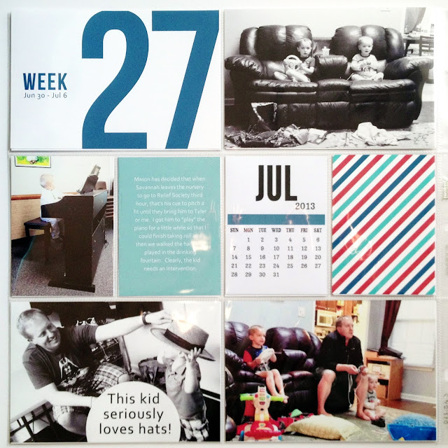
Week 27 Full Spread.
Week 27 Left Side. The striped card is from the Honey kit, though I recolored the blue and red slightly. | The picture of Tyler putting the hat on Mason is a success story about strategically positioning captions. Lincoln walked into the shot and his head is on the bottom of the picture. But since you can still see the cute interaction between Tyler and Mason, I just covered Lincoln's head with a half circle and caption.
Week 27 Right Side. The star filler card is from the Honey kit. Again I recolored it a little. | I got the idea for the Pledge of Allegiance flag card here, and I decided to make my own version as a filler for this week. See below for a free printable. | The glare on the upper right photo makes the caption tough to read. I got a new hands free selfie app and asked Tyler if he wanted to try it out with me. This was the result. The picture is pretty low-res because I had to zoom in, but that was the funny part, so I went with it. | I didn't realize until I printed them how dark the pictures of the room painting were. I'm debating leaving them as they are or lightening them up and reprinting.
(Free for personal use. Click to enlarge, then right-click and save.)
Thanks for looking! You can check out my other
Project Life pages here.
(I'll be linking up to Project Life Tuesday at The Mom Creative. And for more information on Project Life, click here.)


Fun pages. You have so many great pics. :) I was all excited thinking that you were actually painting script onto your walls when I first glanced at the one photo. :) I've always wanted to try it, but am a chicken.
ReplyDeleteThank you! Wow, I'd be way too chicken to try that as well! I have seen a cool idea to buy a big piece of plywood or equivalent, paint it with whatever bold pattern you're loving, and then just prop it along a section of wall. The visual effect without the commitment. :)
DeleteLove the Then & Now photos!
ReplyDeleteThanks, Suzanne! I loved that they were so similar as well!
DeleteSuper pages! I love all the white space. I am so not good at leaving white space. Ha! :) I love how you slightly recolored the Honey cards to work for your layout too.
ReplyDeleteOoh, lots to love. Like the vertical panel you created with the Superhero photo's. Also love the then & now comparison.
ReplyDeleteThanks, Alida! It's so fun to try new techniques and concepts each week!
DeleteSomehow I missed your post from last week. I am so sorry about the passing of your sweet niece. I love how you did your layout to remember her. That "You are so loved," card is so sweet with her picture. This week's layouts are very cute too!
ReplyDeleteI love your layouts. That Then and Now photo is just precious.
ReplyDelete